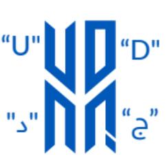
Rationale Logo

The Color
A deep vivid blue symbolizing reliability and trust. The vivid aspect of the blue reflects the campus dynamism and inclusivity.
The Pillar
The overall logo gathers multiple elements, ultimately forming a structure that represents the 4 pillars of education
in one strong foundation. It reveals the purpose of the brand: to empower students with hands-on competencies and applied education resulting in skilled, talented, and work-ready graduates who can answer the needs of an ever-evolving national and global economy.

The Letters
“ج “and " د "the initials of the University in Arabic alongside “U" and “D" the initials of the University in English connected together to form one entity.
The interconnectivity of the letters reveals a University rooted in the Qatari culture but open to the World.
The Parallelograms

symbolize an open book and wings.
These two entities stand together side by side and represent the support that UDST offers to its students in their educational journey, fostering a culture of Academic Excellence.

